

Omni-Channel Retailer
Oz Hair & Beauty
Branding
UX Design
Motion Design
Following a full rebrand in 2022, Oz Hair and Beauty sought to elevate their online presence and loyalty offering. I led the design for the loyalty program, overseeing brand identity creation, UI/UX design, and motion assets to support an omni-channel expansion.

View Live Website


The Problem
The original reward system was confusing, unclear and complicated. This was largely due to both a misaligned program strategy and unclear communication through design. This led to lower than expected engagement rates and customer retention.
Goals
- Communicate the system and benefits clearly
- Increase signups by 20%
- Develop a design system for loyalty related features
Research & Insights
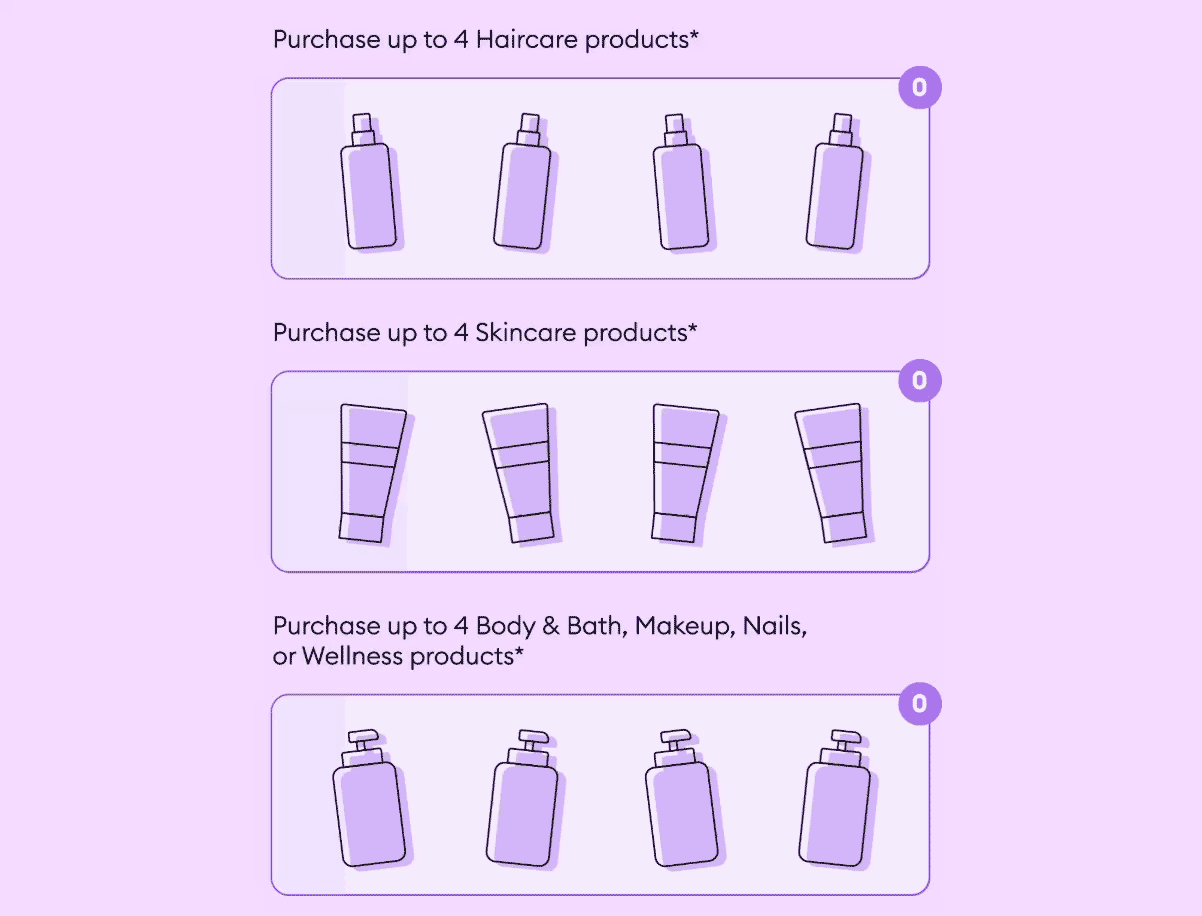
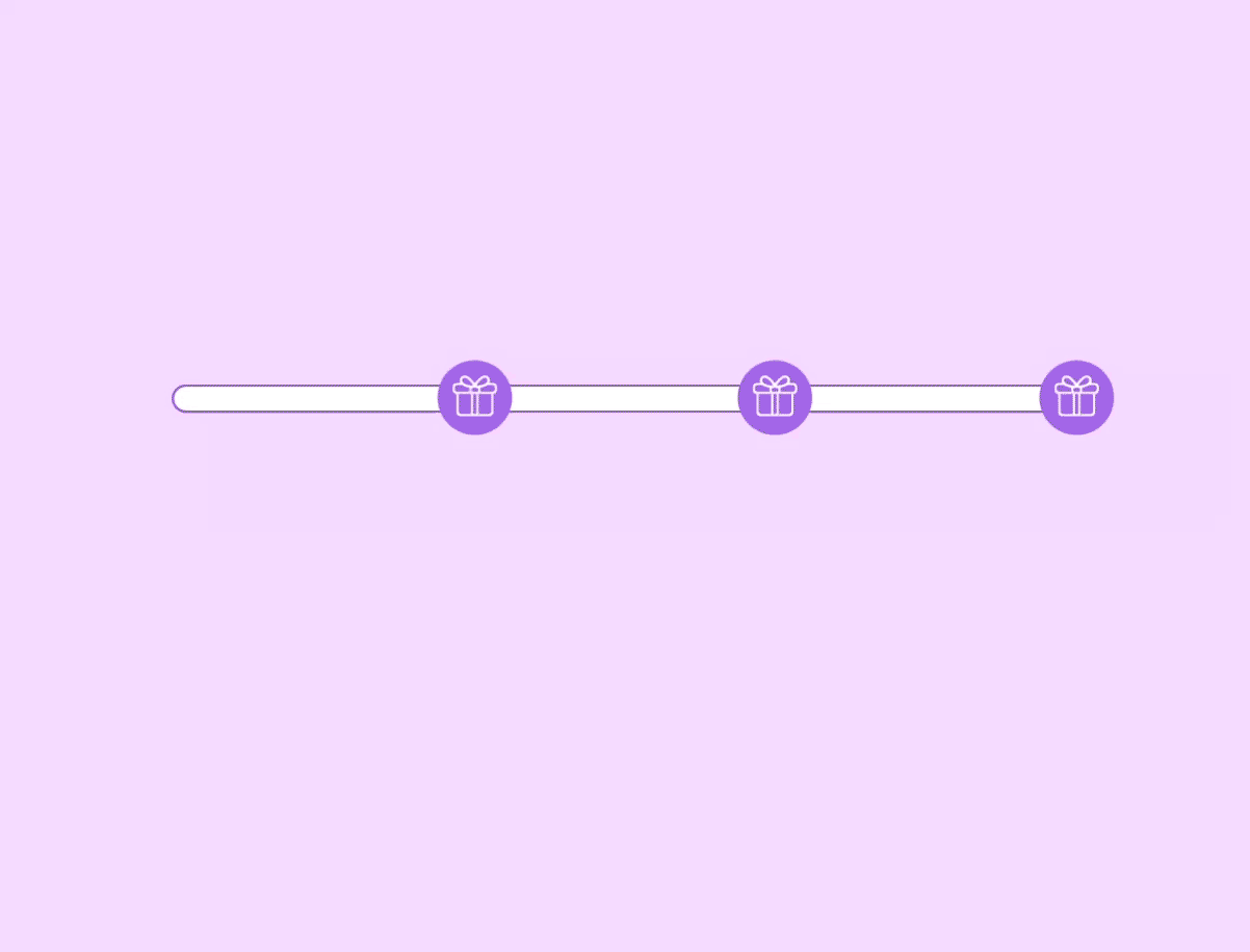
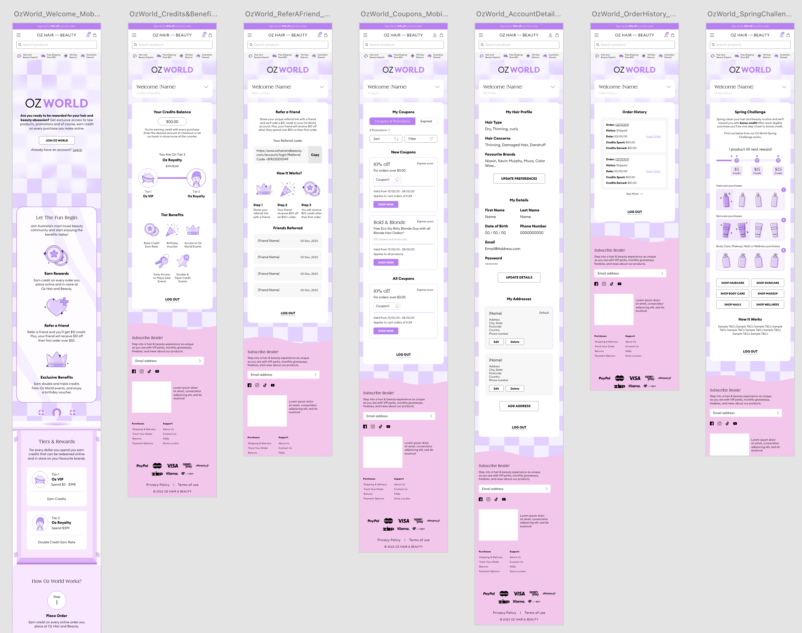
The CRM team had insights from their existing user data. They found that users were unsure how the point system worked, the signup process was complicated and the visual disconnect from the shopping experience and loyalty experience was confusing. These insights directly informed the design priorities. Simplify the signup flow, visually integrate loyalty with the shopping experience, and clearly showcase points earning mechanics across all touch points.
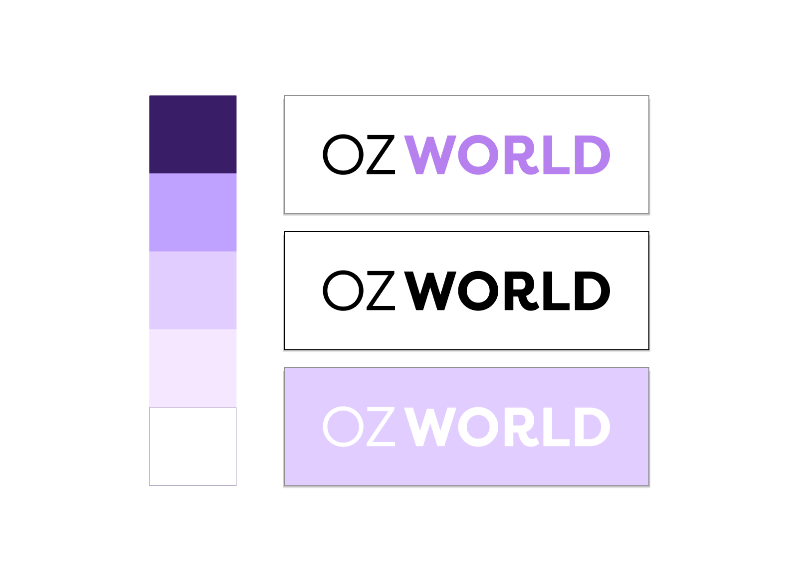
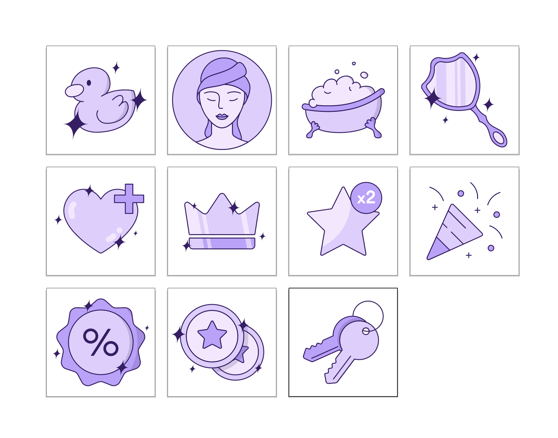
Branding Design
Motion Design
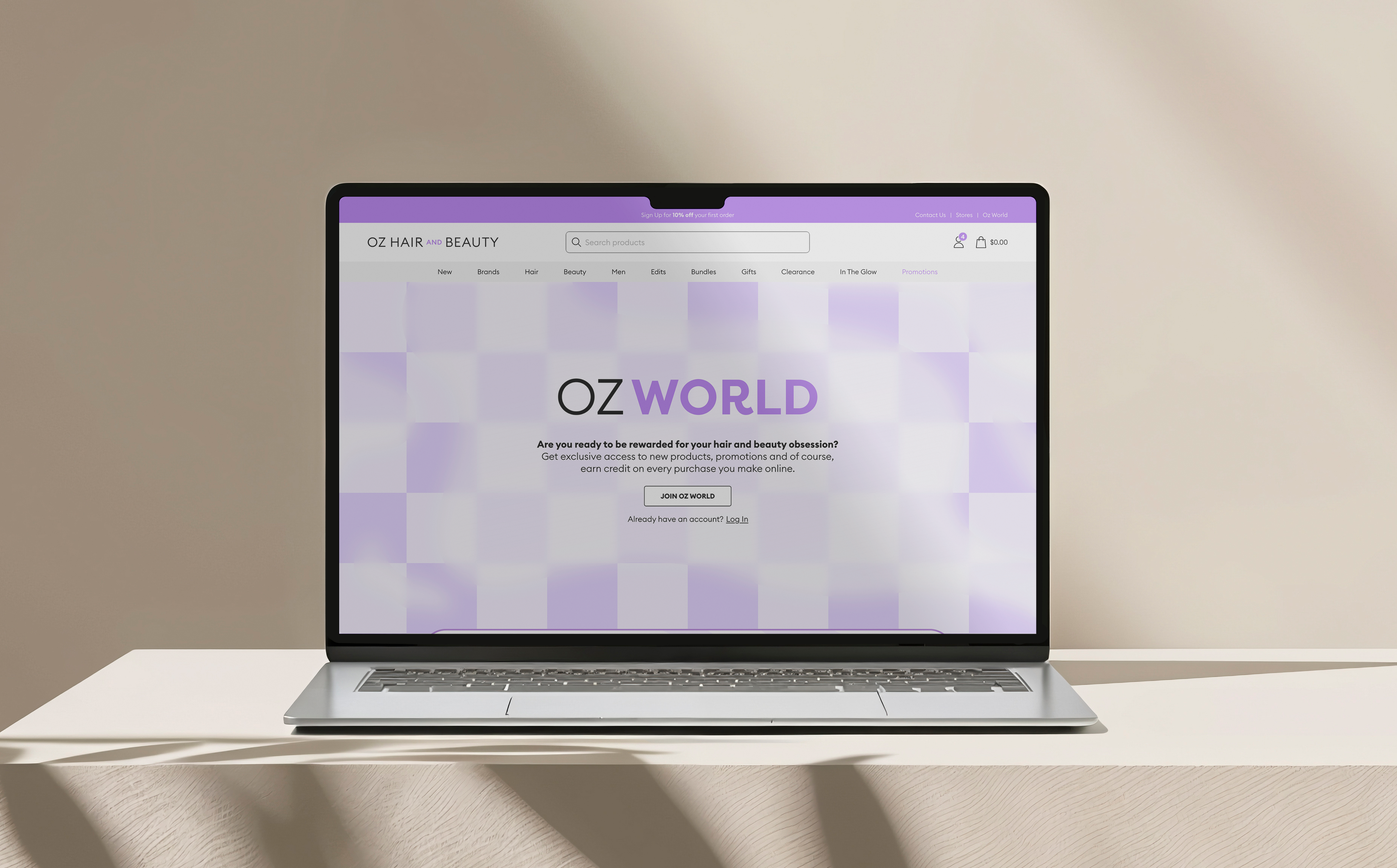
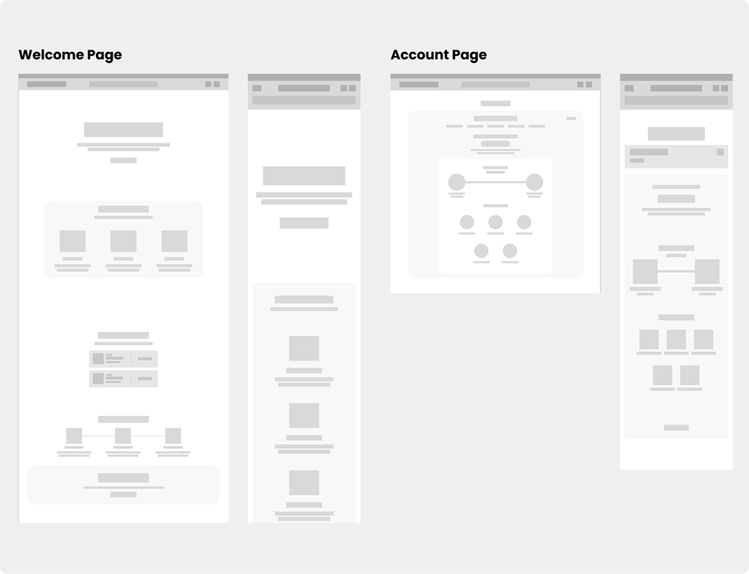
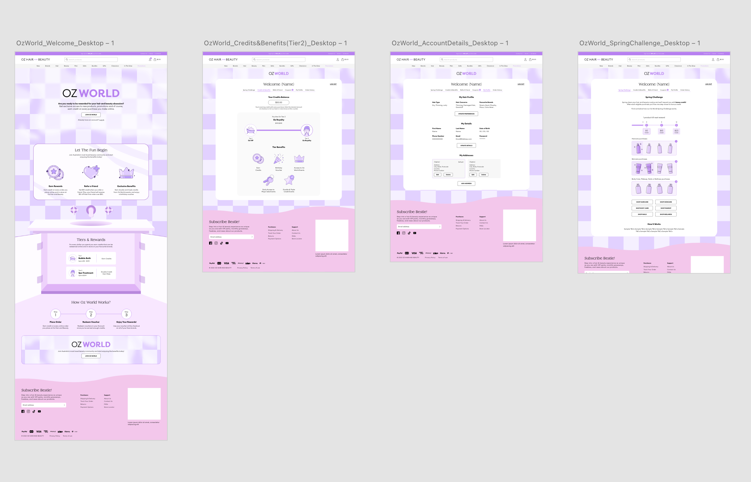
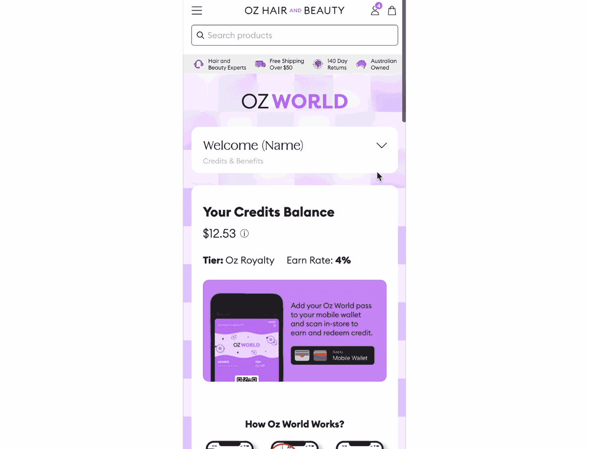
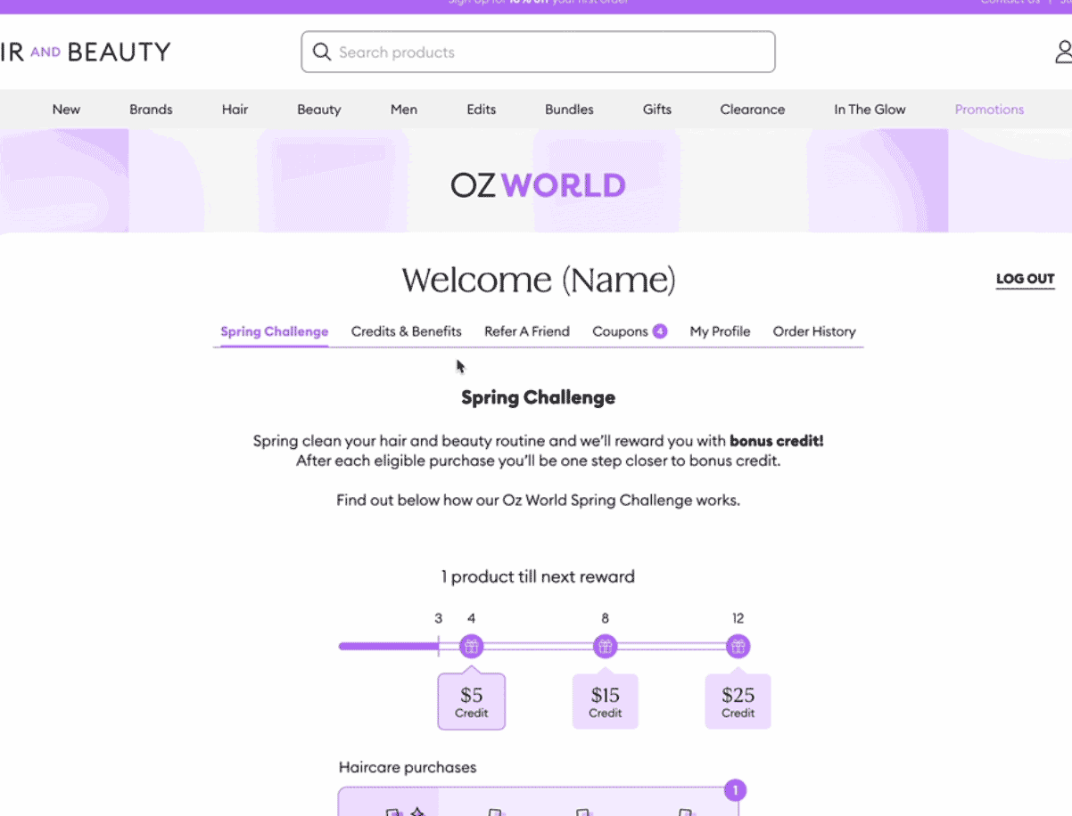
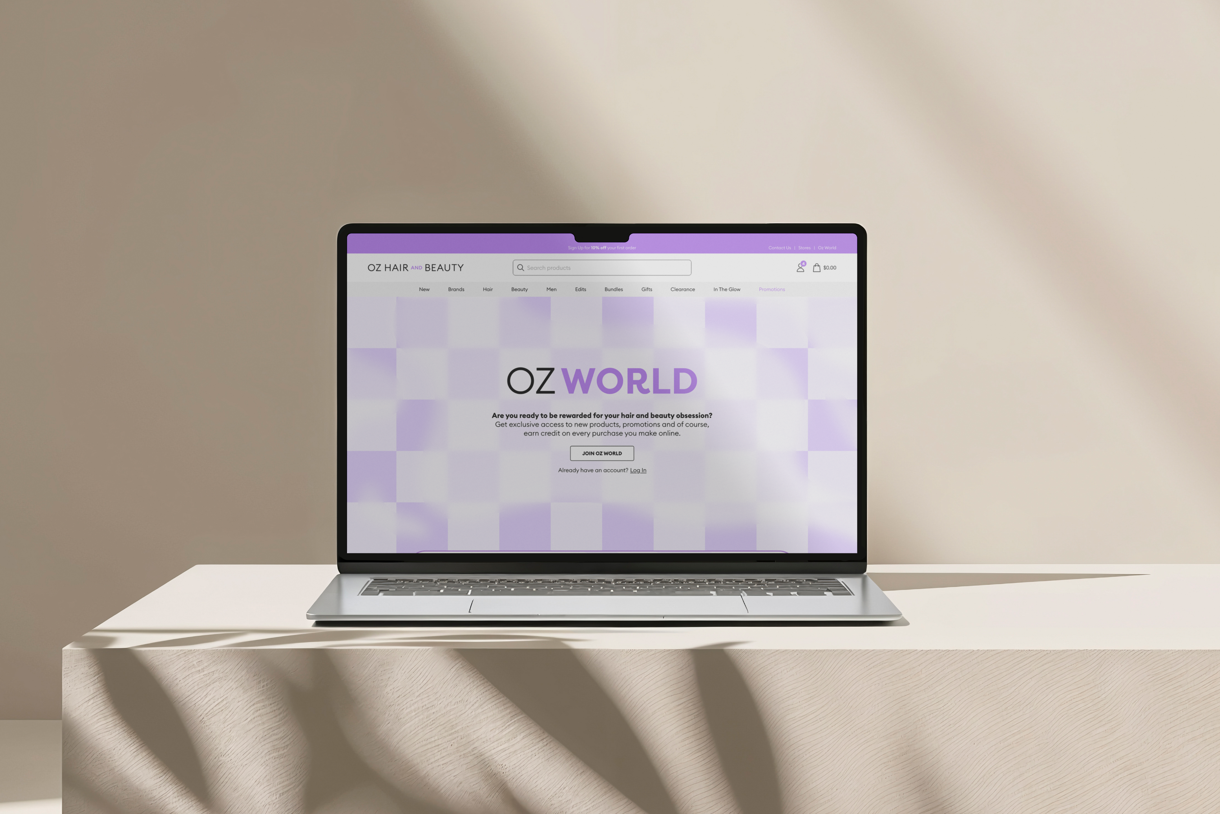
Website Mockup
Prototypes
Reflection & Results
Outcomes
- The new loyalty program branding successfully engaged customers, helping create a recognisable experience.
- The redesigned UX journey led to an increase in loyalty signups and improved overall user understanding of the program’s benefits.
Learnings
- Building a design system is not just about presentational clarity, it must account for content and feature evolution over time.
- In hindsight, adding a more flexible component framework or tab hierarchy could have future proofed the layout more effectively.
let’s talk

Here’s My LinkedIn


Omni-Channel Retailer
Oz Hair & Beauty
Branding
UX Design
Motion Design
Following a full rebrand in 2022, Oz Hair and Beauty sought to elevate their online presence and loyalty offering. I led the design for the loyalty program, overseeing brand identity creation, UI/UX design, and motion assets to support an omni-channel expansion.

View Live Website


The Problem
The original reward system was confusing, unclear and complicated. This was largely due to both a misaligned program strategy and unclear communication through design. This led to lower than expected engagement rates and customer retention.
Goals
- Communicate the system and benefits clearly
- Increase signups by 20%
- Develop a design system for loyalty related features
Research & Insights
The CRM team had insights from their existing user data. They found that users were unsure how the point system worked, the signup process was complicated and the visual disconnect from the shopping experience and loyalty experience was confusing. These insights directly informed the design priorities. Simplify the signup flow, visually integrate loyalty with the shopping experience, and clearly showcase points earning mechanics across all touch points.

Branding Design
Motion Design
Website Mockup
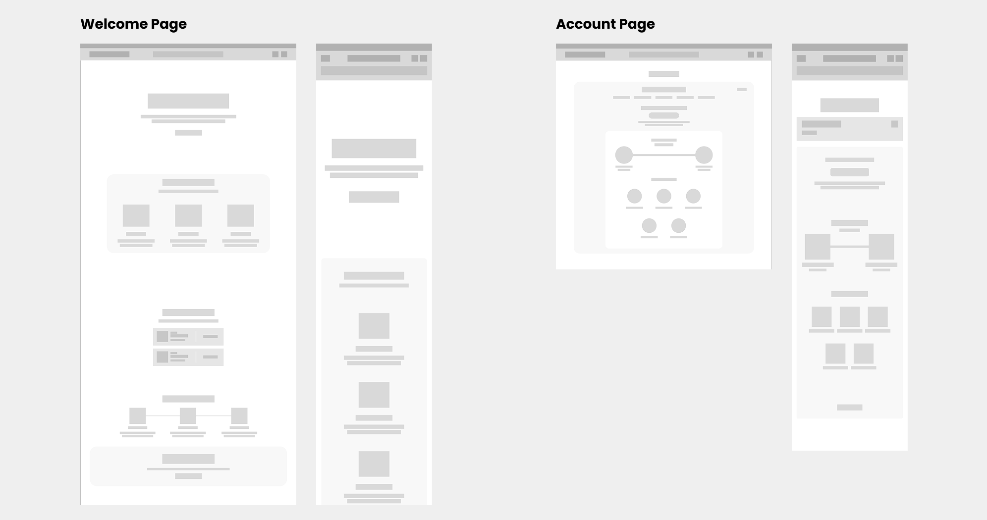
Prototypes
Reflection & Results
Outcomes
- The new loyalty program branding successfully engaged customers, helping create a recognisable experience.
- The redesigned UX journey led to an increase in loyalty signups and improved overall user understanding of the program’s benefits.
Learnings
- Building a design system is not just about presentational clarity, it must account for content and feature evolution over time.
- In hindsight, adding a more flexible component framework or tab hierarchy could have future proofed the layout more effectively.
let’s talk

Here’s My LinkedIn

Omni-Channel Retailer
Oz Hair & Beauty
Branding
UX Design
Motion Design
Following a full rebrand in 2022, Oz Hair and Beauty sought to elevate their online presence and loyalty offering. I led the design for the loyalty program, overseeing brand identity creation, UI/UX design, and motion assets to support an omni-channel expansion.
View Live Website

The Problem
The original reward system was confusing, unclear and complicated. This was largely due to both a misaligned program strategy and unclear communication through design. This led to lower than expected engagement rates and customer retention.
Goals
- Communicate the system and benefits clearly
- Increase signups by 20%
- Develop a design system for loyalty related features
Research & Insights
The CRM team had insights from their existing user data. They found that users were unsure how the point system worked, the signup process was complicated and the visual disconnect from the shopping experience and loyalty experience was confusing. These insights directly informed the design priorities. Simplify the signup flow, visually integrate loyalty with the shopping experience, and clearly showcase points earning mechanics across all touch points.
Branding Design
Motion Design
Website Mockup
Prototypes
Reflection & Results
Outcomes
- The new loyalty program branding successfully engaged customers, helping create a recognisable experience.
- The redesigned UX journey led to an increase in loyalty signups and improved overall user understanding of the program’s benefits.
Learnings
- Building a design system is not just about presentational clarity, it must account for content and feature evolution over time.
- In hindsight, adding a more flexible component framework or tab hierarchy could have future proofed the layout more effectively.
let’s talk
Here’s My LinkedIn