


Haircare Brand
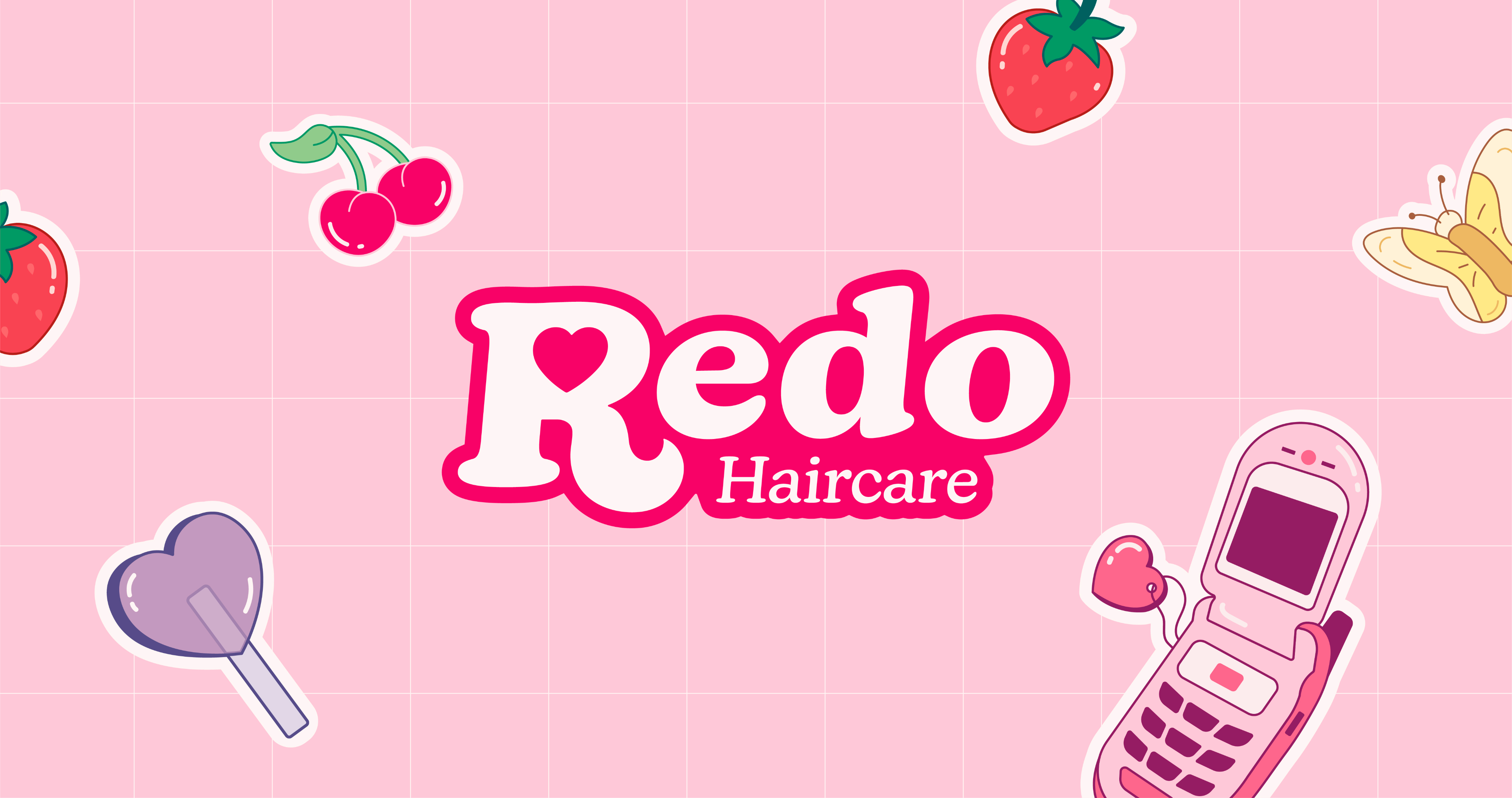
Redo Haircare
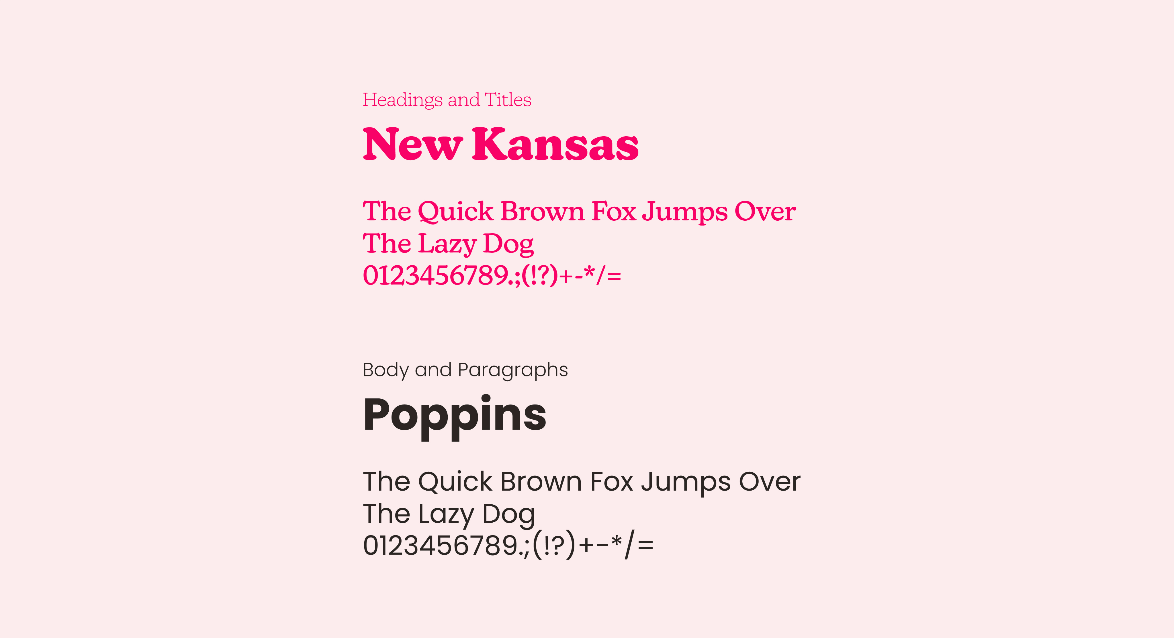
Branding
UX Design
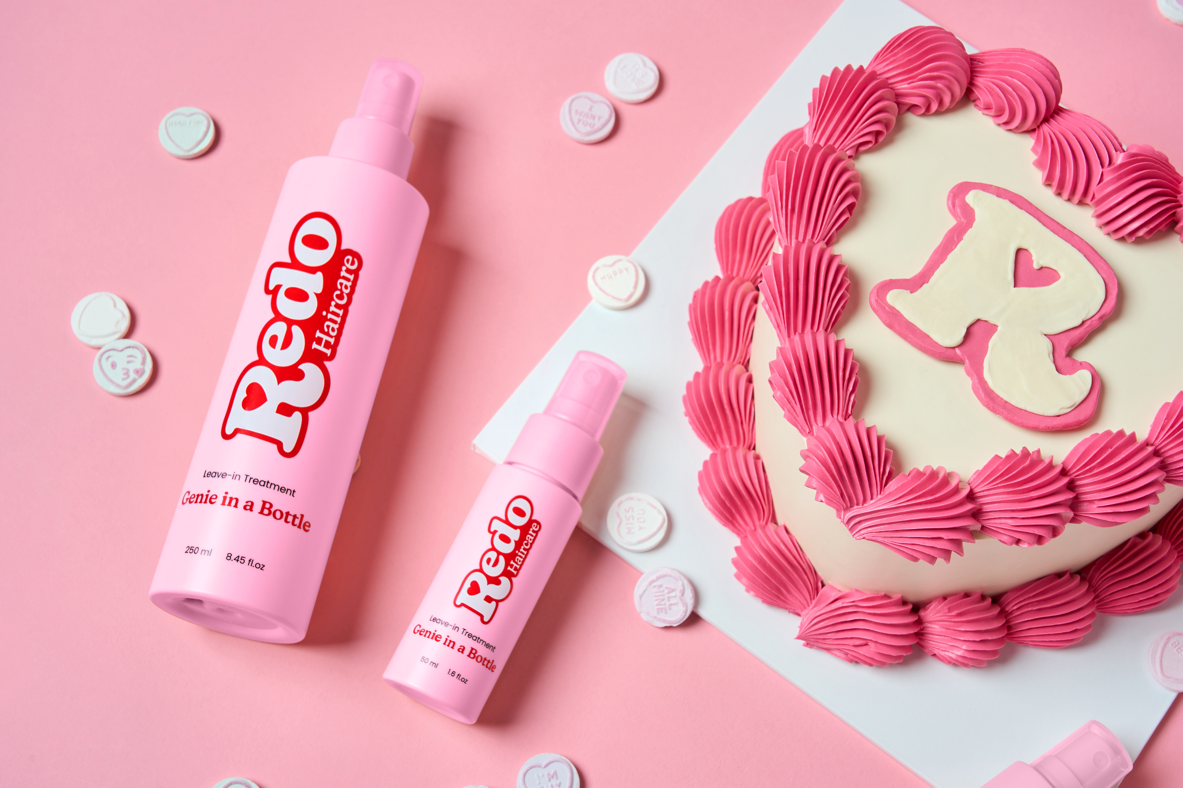
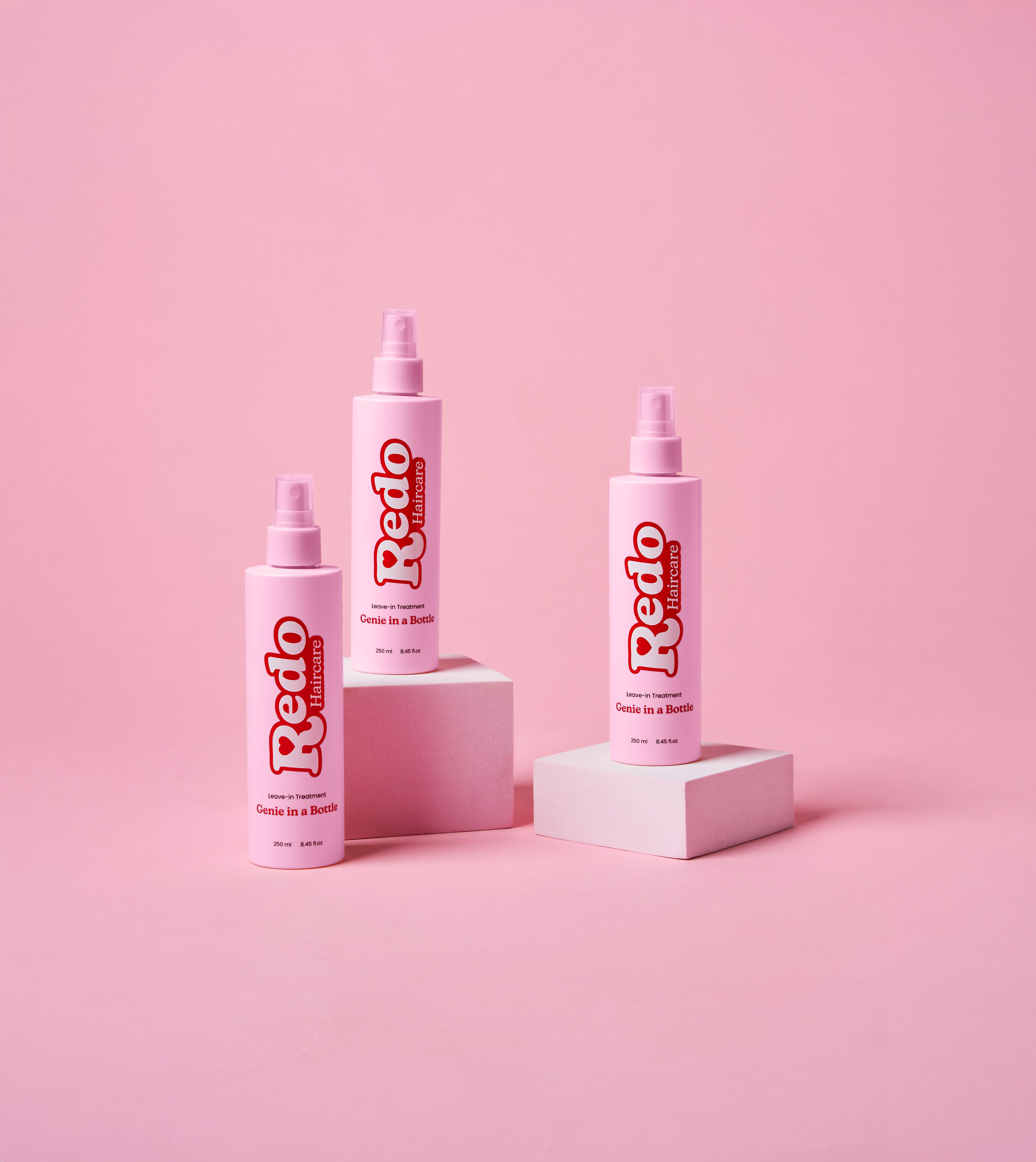
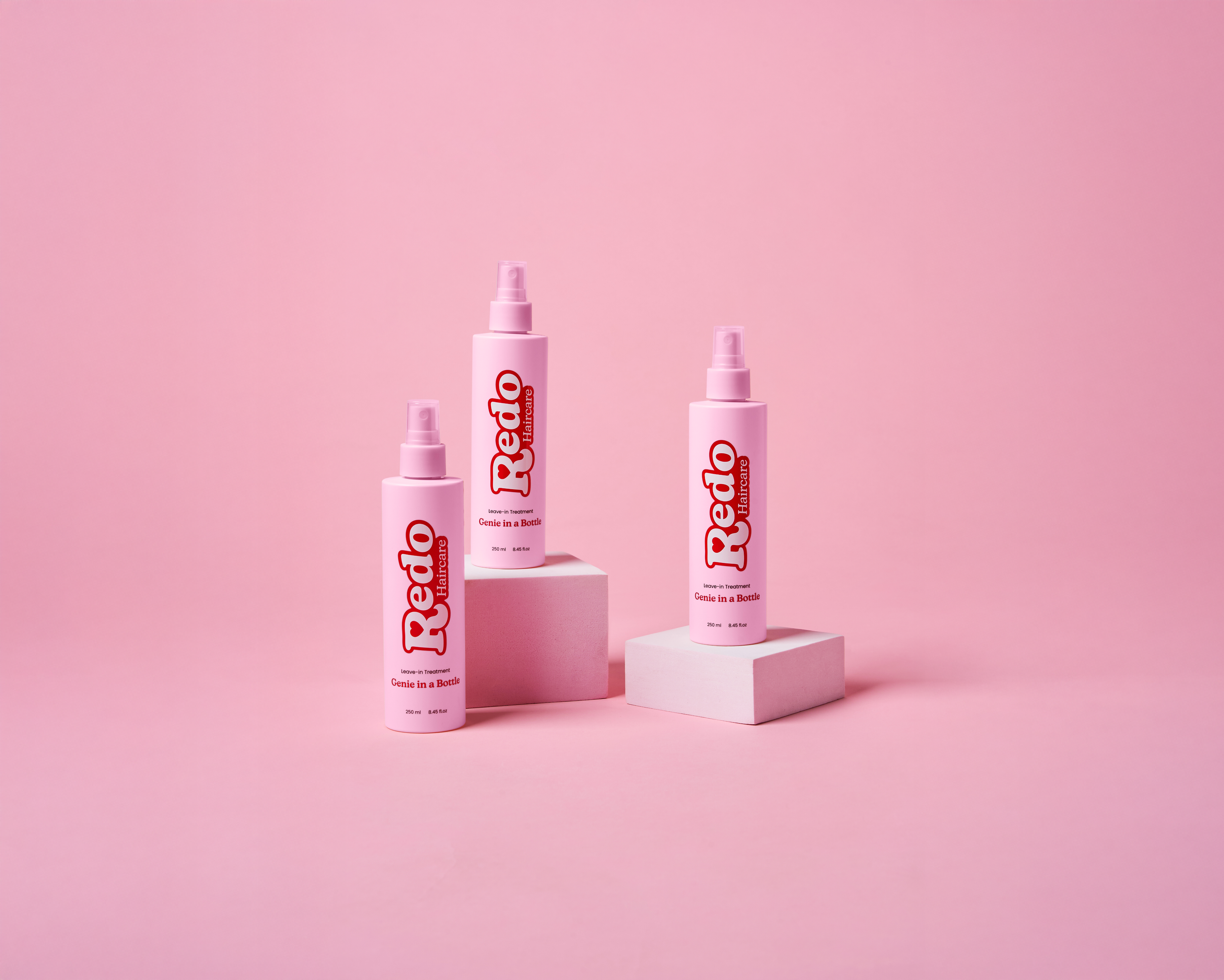
Packaging
Redo Haircare brought me on during their early brand development phase, seeking a designer to lead branding, user interface design, and packaging. Their mission was to revive the joyful connection we associate with nostalgic brands such as scents, colours and branding, while delivering modern product innovations tailored to today’s beauty conscious consumer.

View Old Website


The Problem
Redo needed to establish itself as a new brand while utilising the emotional connection with the user, tapping into old memories, evoking nostalgia without appearing dated or childish.
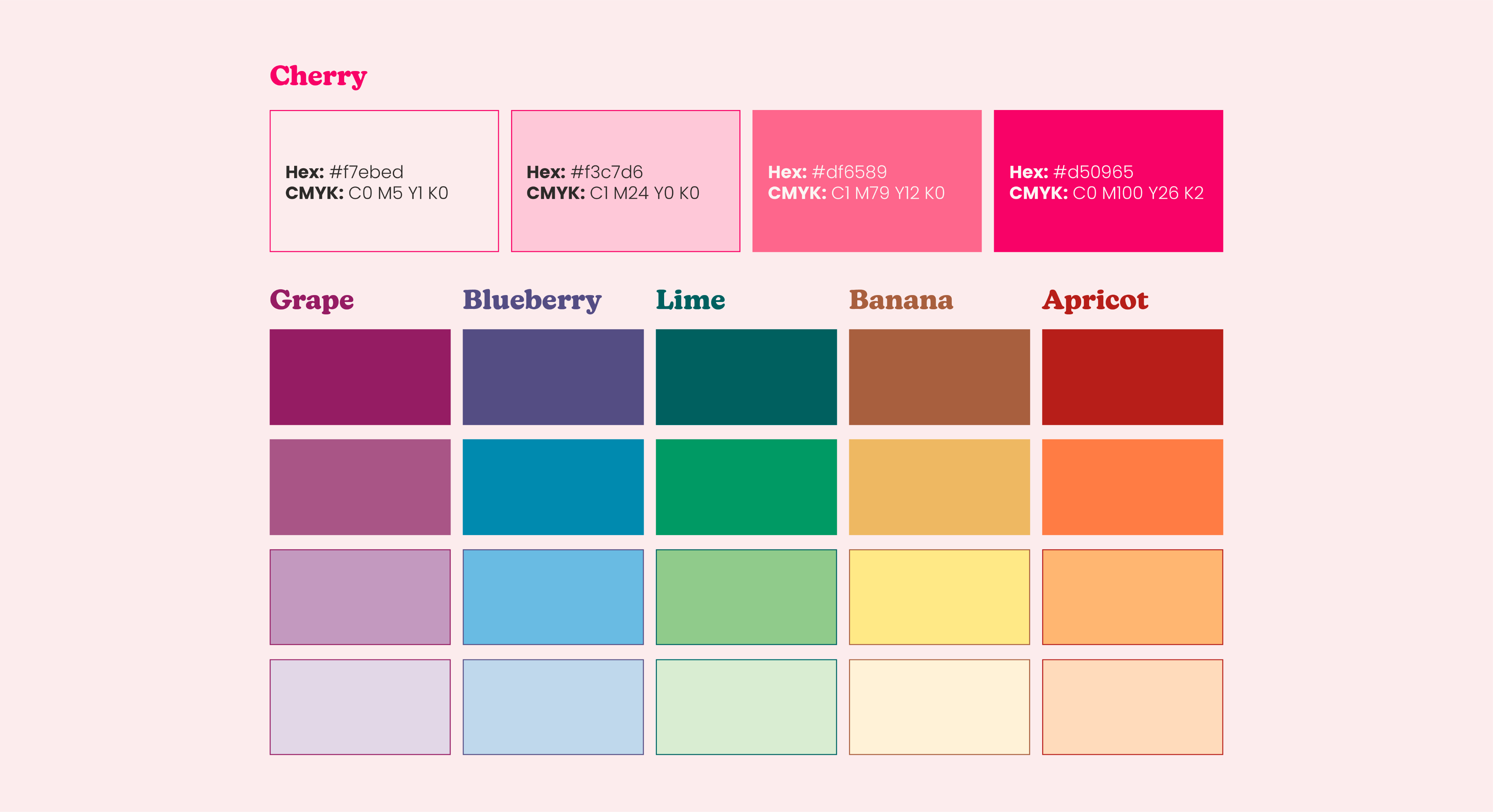
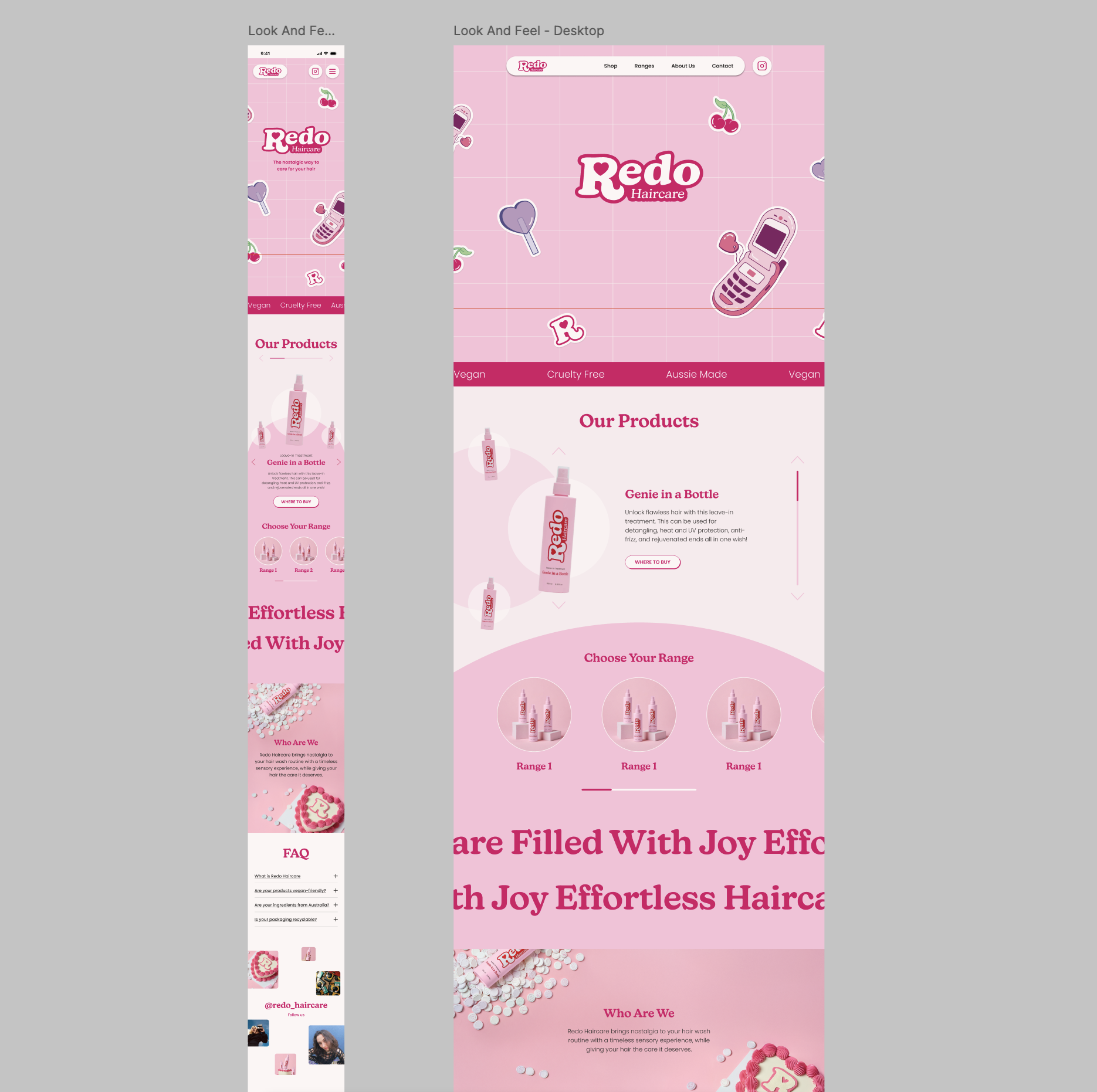
The visual system needed to be adaptable, using distinct colour systems for product collections to coexist under one unified brand.
Goals
- Create a nostalgic yet modern brand identity tailored to 25–34 year olds
- Develop a color system suitable for both web and print
- Ensure design scalability for product expansion
- Design a UX-forward, intuitive website that sets the emotional tone of the brand
Research & Insights
To establish a strong creative direction rooted in user understanding, I conducted visual and contextual research focused on four key areas: colour, scent associations, packaging styles, and nostalgic imagery. In addition, I analysed modern haircare brands to understand how they present their full product lineup cohesively while differentiating between collections
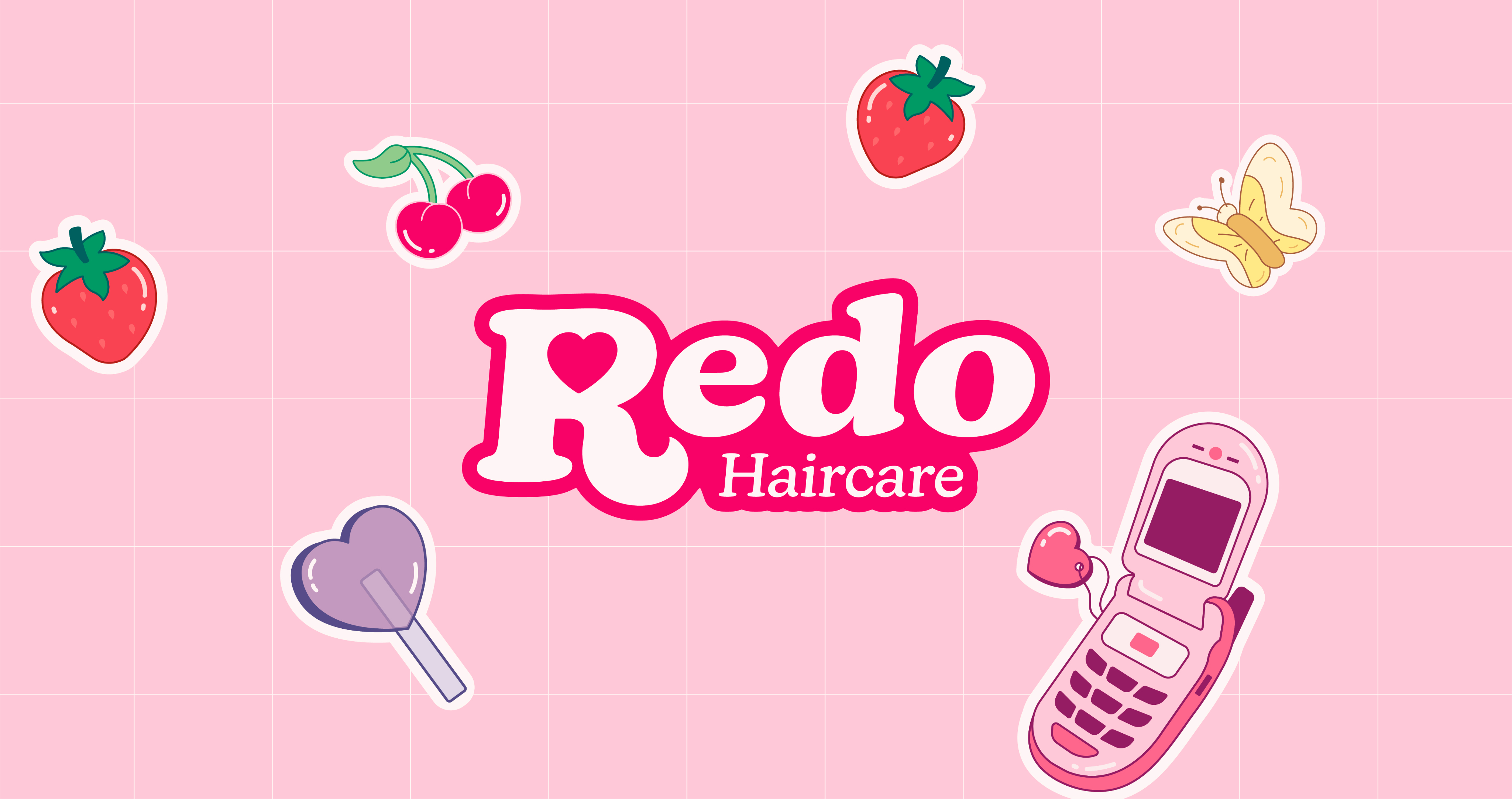
Branding Design

Product Design
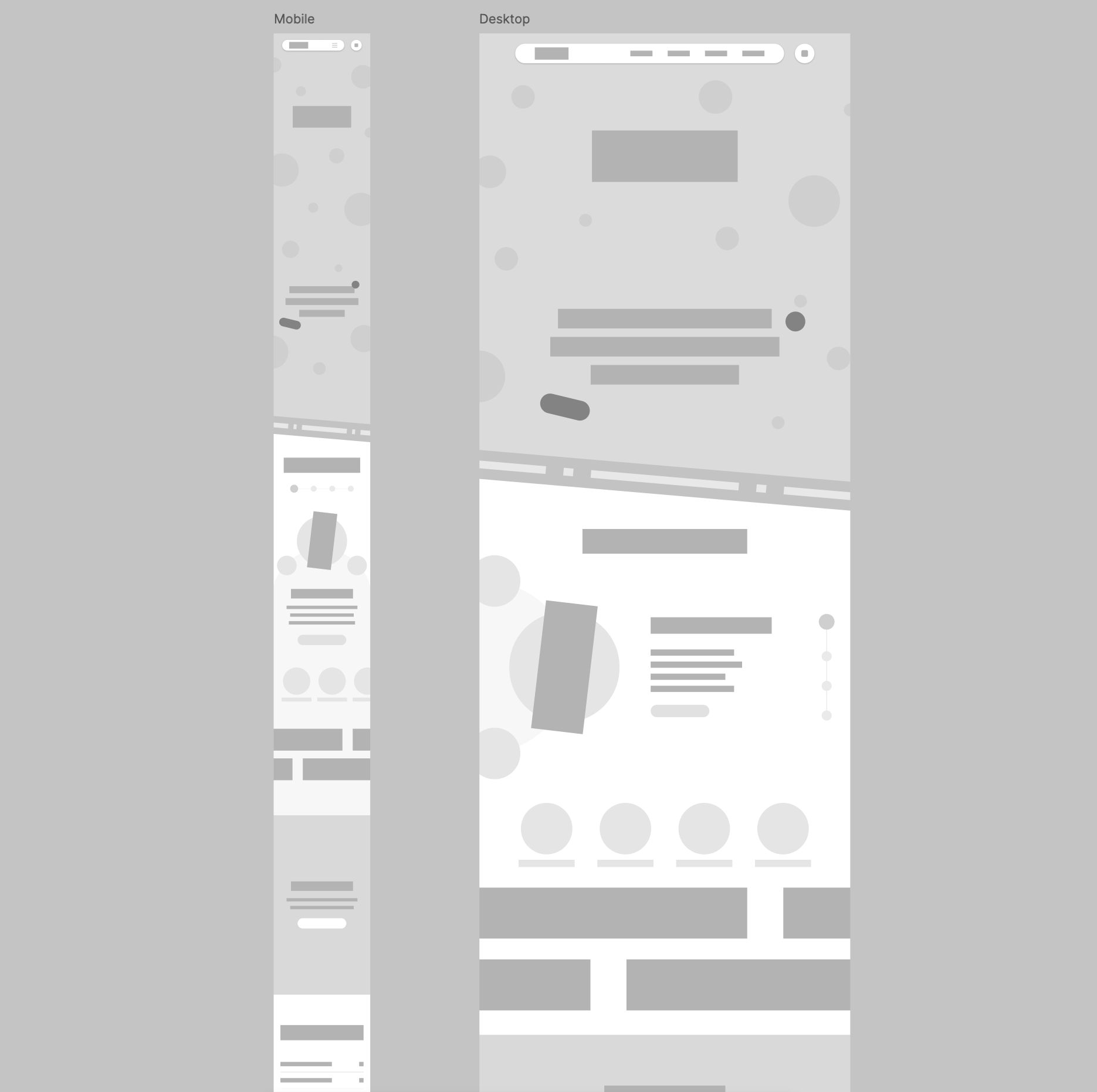
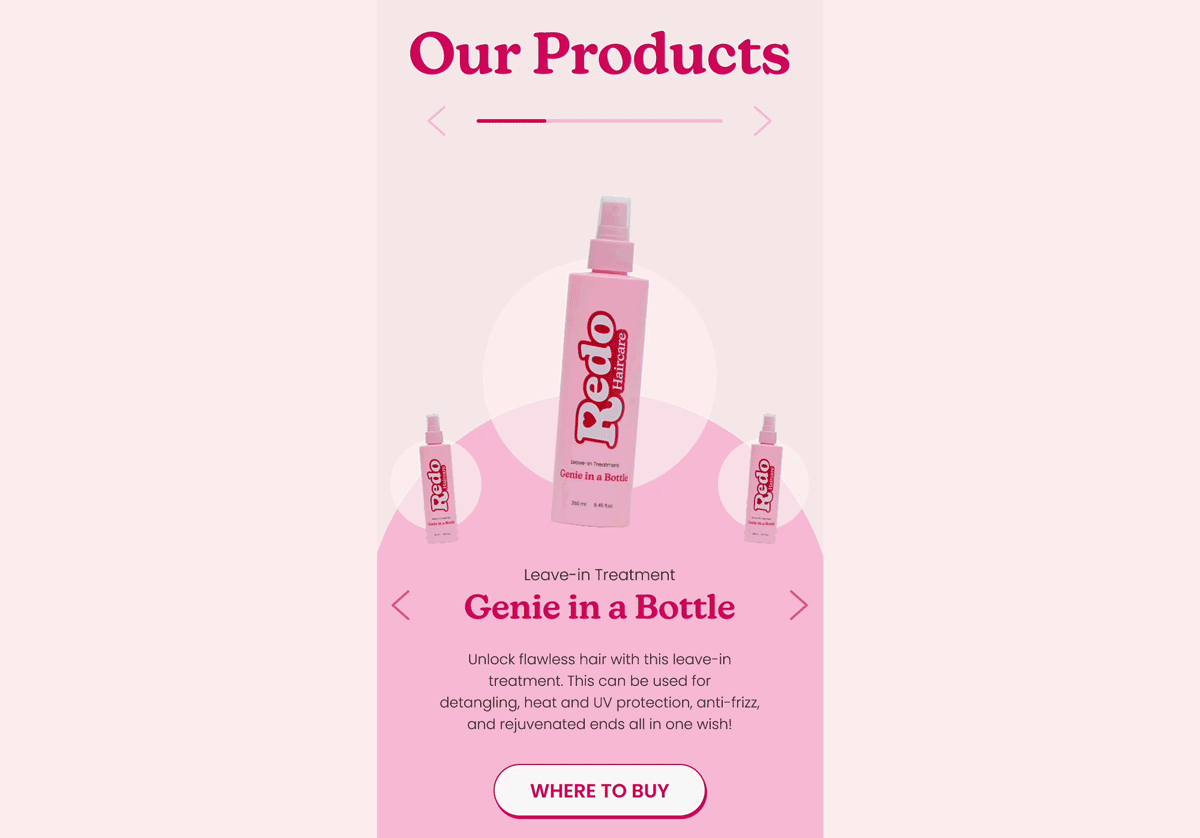
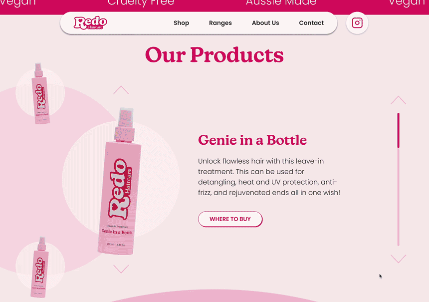
Website Mockup
Prototypes
Reflection & Results
Outcomes
- The brand exceeded its sales projections in the first month, with positive feedback from both retailers and customers.
- The design system proved scalable, allowing us to mock up future product ranges quickly and consistently without creative bottlenecks.
Learnings
- A well structured brand system with modular colour and layout rules is critical for future proofing product expansion.
- Even when you intentionally avoid a childish look, playful branding can still attract younger audiences or their parents a reminder that brand perception evolves once it's in the real world.
let’s talk

Here’s My LinkedIn


Haircare Brand
Redo Haircare
Branding
UX Design
Packaging
Redo Haircare brought me on during their early brand development phase, seeking a designer to lead branding, user interface design, and packaging. Their mission was to revive the joyful connection we associate with nostalgic brands such as scents, colours and branding, while delivering modern product innovations tailored to today’s beauty conscious consumer.

View Old Website


The Problem
Redo needed to establish itself as a new brand while utilising the emotional connection with the user, tapping into old memories, evoking nostalgia without appearing dated or childish.
The visual system needed to be adaptable, using distinct colour systems for product collections to coexist under one unified brand.
Goals
- Create a nostalgic yet modern brand identity tailored to 25–34 year olds
- Develop a color system suitable for both web and print
- Ensure design scalability for product expansion
- Design a UX-forward, intuitive website that sets the emotional tone of the brand
Research & Insights
To establish a strong creative direction rooted in user understanding, I conducted visual and contextual research focused on four key areas: colour, scent associations, packaging styles, and nostalgic imagery. In addition, I analysed modern haircare brands to understand how they present their full product lineup cohesively while differentiating between collections.

Branding Design

Product Design
Website Mockup
Prototypes
Reflection & Results
Outcomes
- The brand exceeded its sales projections in the first month, with positive feedback from both retailers and customers.
- The design system proved scalable, allowing us to mock up future product ranges quickly and consistently without creative bottlenecks.
Learnings
- A well structured brand system with modular colour and layout rules is critical for future proofing product expansion.
- Even when you intentionally avoid a childish look, playful branding can still attract younger audiences or their parents a reminder that brand perception evolves once it's in the real world.
let’s talk

Here’s My LinkedIn


Haircare Brand
Redo Haircare
Branding
UX Design
Packaging
Redo Haircare brought me on during their early brand development phase, seeking a designer to lead branding, user interface design, and packaging. Their mission was to revive the joyful connection we associate with nostalgic brands such as scents, colours and branding, while delivering modern product innovations tailored to today’s beauty conscious consumer.
View Old Website

The Problem
Redo needed to establish itself as a new brand while utilising the emotional connection with the user, tapping into old memories, evoking nostalgia without appearing dated or childish.
The visual system needed to be adaptable, using distinct colour systems for product collections to coexist under one unified brand.
Goals
- Create a nostalgic yet modern brand identity tailored to 25–34 year olds
- Develop a color system suitable for both web and print
- Ensure design scalability for product expansion
- Design a UX-forward, intuitive website that sets the emotional tone of the brand
Research & Insights
To establish a strong creative direction rooted in user understanding, I conducted visual and contextual research focused on four key areas: colour, scent associations, packaging styles, and nostalgic imagery. In addition, I analysed modern haircare brands to understand how they present their full product lineup cohesively while differentiating between collections.
Branding Design
Product Design
Website Mockup
Prototypes
Reflection & Results
Outcomes
- The brand exceeded its sales projections in the first month, with positive feedback from both retailers and customers.
- The design system proved scalable, allowing us to mock up future product ranges quickly and consistently without creative bottlenecks.
Learnings
- A well structured brand system with modular colour and layout rules is critical for future proofing product expansion.
- Even when you intentionally avoid a childish look, playful branding can still attract younger audiences or their parents a reminder that brand perception evolves once it's in the real world.
let’s talk
Here’s My LinkedIn